

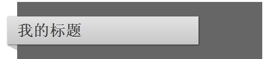
在大量的网页设计作品中,都用到了这种折叠效果,通常用于标题背景。一般可以用PhotoShop来实现这样的效果,但是在当今广泛提倡减少网页图片使用量的情况下,我们还是少用图片为好。其实使用CSS是可以很容易地实现这种效果的,废话少说,直接上代码:
代码如下:
<!DOCTYPE html>

<html lang="en">
<head>
	<meta charset="utf-8">
	<title>CSS Shapes</title>

	<style>

#container {
	background: #666;
	margin: auto;
	width: 500px;
	height: 700px;
	padding-top: 30px;
	font-family: helvetica, arial, sans-serif;
	}

h1 {
	 background: #e3e3e3;
	 background: -moz-linear-gradient(top, #e3e3e3, #c8c8c8);
	 background: -webkit-gradient(linear, left top, left bottom, from(#e3e3e3), to(#c8c8c8));
	 padding: 10px 20px;
	 margin-left: -20px;
	 margin-top: 0;
	 position: relative;
	 width: 70%;

	-moz-box-shadow: 1px 1px 3px #292929;
	-webkit-box-shadow: 1px 1px 3px #292929;

	color: #454545;
	text-shadow: 0 1px 0 white;
}

.arrow {
	 width: 0; height: 0;
	 line-height: 0;
	 border-left: 20px solid transparent;
	 border-top: 10px solid #c8c8c8;
	 top: 104%;
	 left: 0;
	 position: absolute;
}


	</style>

	<!--[if IE]>
		<style>
			.arrow { top: 100%; }
		</style>
	<![endif]-->

</head>
<body>
	 <div id="container">

		<h1> My Heading <span class="arrow"></span> </h1>

	</div>
</body>
</html>
这其中关键的属性是border-left 和 border-top,这两个属性形成了一个三角形效果,也就是带子的拐角效果。
border-right、border-left和border-bottom、border-top的不同组合,可以实现三角形的不同的朝向,你可以举一反三制作你的折叠效果了

评论 (0)